
Web Design Agency
Built for Business Growth.
Web design that turns visitors into customers, built around how people actually decide.
Then the decision gets made, before anyone reads a word you wrote. In that instant, a visitor’s mind has already judged whether your business looks credible enough to trust. Everything that follows either confirms that decision or fights it.
Great web design builds trust & credibility
Your website is usually the first impression a potential customer has of your business. What does your site actually communicate about your brand? It should inspire confidence and show your business as trustworthy and relevant. A site that’s simple, intuitive, and gets people the information they need quickly earns more of that trust than one that just looks good doing it.
We build every website from scratch, in-house, to make sure it actually reflects your brand and business identity, not a template with your logo dropped in. Our goal is a site that’s both well designed and built to meet real business objectives. Your business is unique. Your website and marketing should be too, and that starts with how people decide to trust it in the first place.
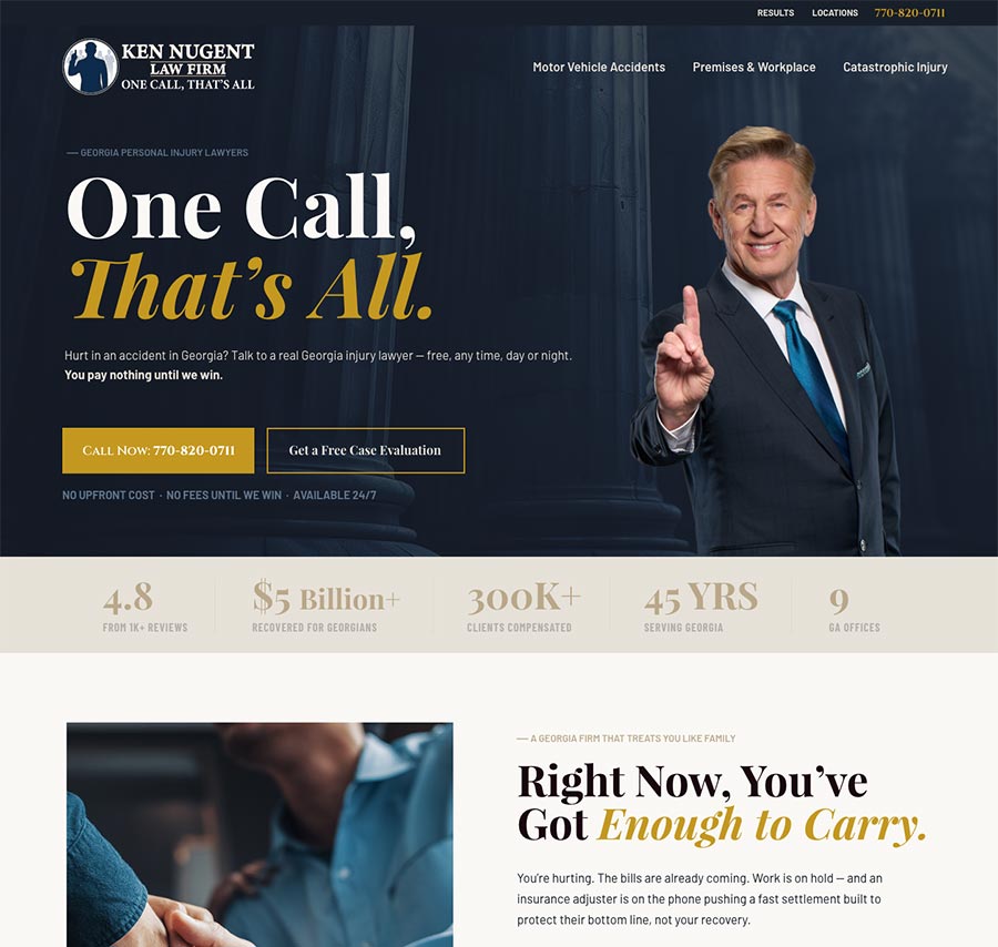
Most Businesses Don’t Have A Marketing Problem
They have an infrastructure problem.
You were told to get a website. You were told to do some SEO. Nobody explained what those things needed to accomplish, or how they were supposed to work together. So you likely ended up with a collection of disconnected pieces that look ok but don’t compound and increase your leads and customers.
We don’t sell websites. We architect digital infrastructure.
A website is a brochure someone looks at once. Infrastructure is an asset that works around the clock, gains value as it ages, and establishes you as the authority in your market before a prospect ever picks up the phone.
Years of experience has taught us how to craft the perfect design that will fit the nature of your business. The strength in our method is the integration of research, communication, usability, and execution in every design. Our mission is to build a website that best represents your brand and helps to build your authority in your market. We work with clients across the country from our home base in Pensacola, Florida.
Your Site Isn’t Broken. It’s Missing Opportunities.
Here’s the difficult part about an established business with an established website: nothing looks wrong.
The phone still rings. Orders still come in. The site loads, the forms work, the photos are reasonably current. By every visible measure it’s doing its job.
But you only ever see the people who stayed.
You don’t see the contractor who opened your site in a parking lot, felt something was off, and called the next result instead. You don’t see the buyer who compared you against two competitors and picked one of them for reasons they couldn’t articulate. Those people don’t fill out a form to tell you why they left. They just leave.
Your bounce rate isn’t a design opinion. It’s a receipt.
That’s the real cost of a site that’s merely fine. Not a dramatic failure you’d notice and fix, a quiet percentage skimmed off every month, invisible because the people it costs you never announce themselves.
The good news is that missed opportunity is measurable, and the mechanisms behind it are well understood.
The Decision Happens Before the Reading Does
Researchers at Carleton University found that people form a first impression of a website in about 50 milliseconds, faster than conscious thought. In that fraction of a second, the brain has already ruled: trustworthy or not, professional or not, stay or leave.
Carleton University
The time it takes to form a first impression of a website, faster than conscious thought.
Stanford Web Credibility Project
Judge an organization’s credibility on design alone. Not the words. Not the offer. Not the credentials.
What Is the 3-Second Rule in Web Design?
The common version says you have three seconds to hold a visitor. That’s roughly right about attention and completely wrong about sequence.
Three seconds is when someone decides whether to keep reading. The trust judgment already happened, in the first tenth of a second, before the page finished rendering. By the time your headline is being read, the visitor isn’t deciding whether you’re credible. They’re looking for confirmation of a verdict they already reached.
This is why redesigns that only fix the copy underperform. The copy is answering a question that closed before anyone got to it.
The practical rule isn’t three seconds. It’s this: whatever loads first has to feel safe. Everything after that either confirms or contradicts the first impression.
Do I trust these people?
That gets answered in the design.
Trust decided
Keep reading?
Who are you?
The Five Triggers
Five mechanisms decide it. None of them are your headline. These are the specific processes the brain runs on every page it lands on, and the design decisions that follow from each one.
What’s the Difference Between SEO and CRO?
SEO (Search Engine optimization) is about arrival. CRO (Conversion Rate Optimization) is about what happens after.
Search optimization determines how many people reach the page. Conversion optimization determines what fraction of them do the thing you built the page for. Two entirely different problems, and most businesses only have someone working on the first.
That imbalance is getting more expensive. As AI answers absorb more of the top of the funnel, fewer visitors arrive by accident. The ones who do arrive are further along and closer to deciding. Lower volume, higher stakes per visit. Every point of conversion is worth more than it was two years ago, and every missed opportunity costs more.
What Are the Principles of Conversion-Focused Design?
Most published lists give you seven: clarity, focus, structured content, consistency, directional cues, friction reduction, social proof.
All correct. All describing symptoms. They tell you what a converting page looks like from the outside. None of them explain why those things work, which means none of them tell you what to do when your page already has all seven and still underperforms.
We work one layer down.
“Use directional cues.”
The brain weighs a loss twice as heavily as an equivalent gain, so momentum has to be built rather than described.
“Add social proof.”
When the brain can’t evaluate something directly it looks for evidence others already have, and that evidence has to carry visual weight to register at all.
Same conclusions. Different starting point. The five triggers are that layer, and they’re what tells you what to fix when the checklist is already checked.
What’s a Good Conversion Rate?
Benchmarks are close to useless without context. Conversion rate is a ratio, and both halves move. A page converting 12% of qualified referral traffic and a page converting 12% of cold paid traffic are not the same page performing the same way.
Worse, chasing a benchmark encourages the wrong fix — filtering out low-intent traffic raises the percentage without adding a single customer.
The number worth tracking is your own, over time, against the same sources, and whether the people converting are the ones you actually want.
This Isn’t a Theme Swap
Anyone can install a template and change the colors. What you get is a site that looks like a thousand others, built by someone who never asked what it needed to do.
We start from your business, not from a layout. Who lands here. What state of mind they’re in. What they need to feel before they’ll act. The single next step worth asking for. Then we engineer the page to produce that.
Decorated, or engineered. The difference shows up in your numbers.
Your website is where trust gets built. Authority Architecture is how people arrive already believing you’re the one to call.
Proven Process
From discovery to launch, the typical timeline is 6–8 weeks.
40+ Builds
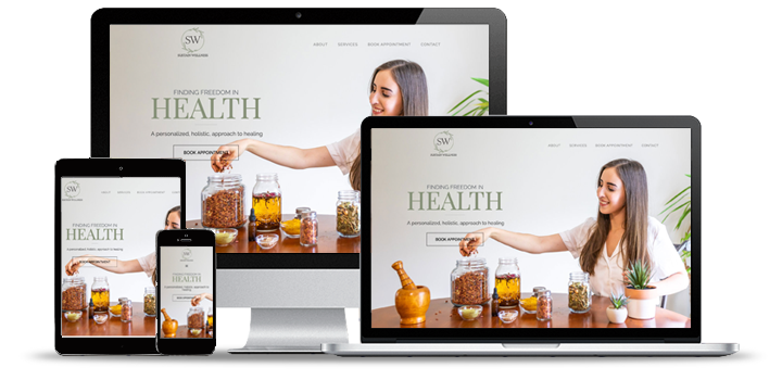
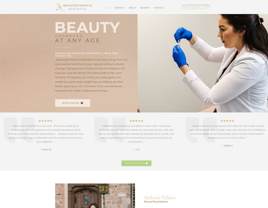
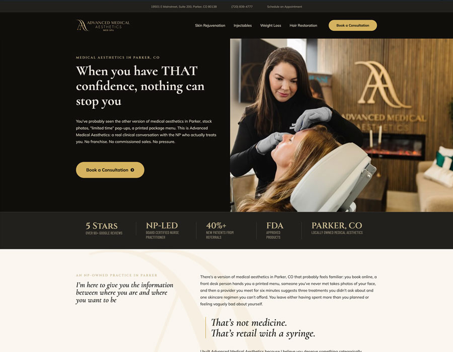
Ecommerce, professional services, medical, music, construction, food and beverage. Different industries, different audiences, one constant: every one was built from how its visitors actually decide.




Customer Reviews
“I have hired Firelight Interactive for 3 different projects. The product quality is consistently outstanding, exceeding my expectations every time and always within budget. I really appreciate the fact they always take time to answer my questions as most don’t. I wish I would have found this company sooner, as I’ve had much different experiences with two other companies. I would highly recommend Firelight Interactive.”
Chad F.
|

Google Review
“Firelight Interactive is the best provider for web design services and website design. They take a proactive approach to determining your overall vision, to eliminate wasted time and money developing your website. I have used them for professional engineering company websites, startup companies and personal websites. I would not trust any other website design company with my online presence.”
Travis P.
|
Google Review
What Does a Website Actually Cost?
Nobody can accurately quote a website honestly without asking what it has to do.
That’s not evasion: it’s the whole problem with the three wildly different proposals sitting in your inbox. They’re pricing different things and calling them the same thing.
What the Site Has to Carry
A site that establishes credibility is a different build from one that qualifies leads, handles transactions, or supports an authority campaign. Same page count, entirely different engineering.
What Condition Your Content Is In
Copy, photography, and product data that are ready to go cost nothing to place. Content that has to be created, rewritten, or rescued is where most budgets quietly go.
How Many Decisions It Supports
One clear path is straightforward. Multiple audiences, multiple services, and multiple entry points require architecture — and architecture is where the real work lives.
These are the reasons we scope before we quote.
One Conversation.
Then You’ll Know.
Book a discovery and we’ll review your website, find the missed opportunities, and tell you what fixing it would actually involve. You’ll leave with a scope and a real number.
We review your market, your competitors, and your current visibility, then map what the system would need to do. This call typically takes about 30 minutes.
Nothing.
No pitch deck, no pressure. If we’re not the right fit, we’ll tell you on the call.